The entire 1982 Atari 2600 catalog is scanned and online at AtariAge. I wore this catalog out as a kid. The interesting thing about the 2600 was that the games were so simplistic that in order to really be transported by them, you had to use your imagination. The artists creating cover art during this time did a worthy job attempting to capture the feeling that the gameplay was supposed to give you (even if, as was the case many times, the actual game came up a bit short). My favorite artists are Steve Hendrickson, Cliff Spohn and Ralph McQuarrie (attribution not 100% certain), who designed the cover art for the 2600 version of Vanguard.
There is a good thread discussing the cover artists here.
A couple of good design links via Boing Boing: Retro-futuristic artwork; some images from Masquerade, The Amazing Camouflage Deceptions of World War II.
'For All Seasons', a small interactive animation at k10k, is simple and beautiful. I think I'll share it with my kids.
'For All Seasons', a small interactive animation at k10k, is simple and beautiful. I think I'll share it with my kids.
 How do you teach your child to lose? You want them to enjoy winning, to develop confidence and have fun at what they do. But you don't want to encourage a false sense (and perhaps a psychological dependence on) winning. Because as they get older, sometimes they'll lose.
Maybe the old “it's not whether you win or lose” cliché is true: Play well, regardless of the outcome. Play well, and in the long run you'll always win, because the victory is internal.

Rose and I went to see Bruce Mau speak last night. Aside from the fact that he gave an inspiring, holistic, invigorating talk about the future of design (see Massive Change), he also had one of the most perfect PowerPoint presentations I've ever seen. The presentation:
- Supplemented what he was presenting with carefully selected images and (occasionally) words
- Did not take away from his presence as a speaker (in fact most of the time the audience was focused on Mau and not the giant screen)
- Did not contain a single bullet point
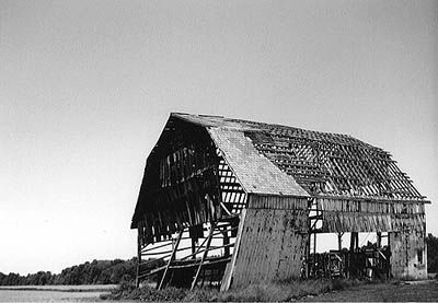
After fifteen years of using a Nikon FG to make photographs like this, this, this and this (the best image I’ve ever made), I finally decided to buy a digital SLR with a decent lens. In the process of bringing myself into 2007 in order to make an educated purchase, I found Ken Rockwell’s technical musings particularly helpful. However, as sharp as his technical workups of digital cameras are, I find his theory of “modern exposure technique” quite troubling:
For as much as he evangelizes the artistic seed of good photography, making points like “Why Your Camera Does Not Matter”, he seems to completely miss the artistic function of photographic variables like ISO, aperture and shutter speed. All of these variables represent creative choices that a photographer must make. Speaking simplistically, ISO affects the negative’s level of grain/noise; aperture (my personal favorite) affects depth of field; shutter speed affects how motion and light are captured in the negative. I would also argue that it is next to impossible to manifest one's creative intent consistently with auto-focus enabled.
I suppose this type of thinking shouldn’t surprise me as popular photography has now completely made the jump from film to digital, with the primary image-viewing venue being the internet (as opposed to the physical gallery). This shortcut thinking evidences itself in the deluge over-saturated, cliché “wow” shots that are consistently so popular on sites like flickr. Good photography consists of more than just wow-shots.
No longer does anyone need to worry about ISOs, apertures or shutter speeds; most cameras do this automatically. All you need to know is when to apply a little bit of correction to the camera's decisions, and you do this by looking at your LCD.
Modern exposure technique is optimizing the exposure compensation as needed, not setting exposure manually. The manual part is making the slight corrections to the automatic exposure, not setting apertures or shutter speeds as in the 1950s.
For as much as he evangelizes the artistic seed of good photography, making points like “Why Your Camera Does Not Matter”, he seems to completely miss the artistic function of photographic variables like ISO, aperture and shutter speed. All of these variables represent creative choices that a photographer must make. Speaking simplistically, ISO affects the negative’s level of grain/noise; aperture (my personal favorite) affects depth of field; shutter speed affects how motion and light are captured in the negative. I would also argue that it is next to impossible to manifest one's creative intent consistently with auto-focus enabled.
I suppose this type of thinking shouldn’t surprise me as popular photography has now completely made the jump from film to digital, with the primary image-viewing venue being the internet (as opposed to the physical gallery). This shortcut thinking evidences itself in the deluge over-saturated, cliché “wow” shots that are consistently so popular on sites like flickr. Good photography consists of more than just wow-shots.
What we discovered when we opened a strange drawer within a strange elephant at the Cincinnati Contemporary Arts Center:
Special bonus--museum designed by rockstar architect Zaha Hadid (what this generally means is that you will find no right angles in the building).
Special bonus--museum designed by rockstar architect Zaha Hadid (what this generally means is that you will find no right angles in the building).
Subscribe to:
Posts (Atom)